Dead Simple Email Landing Page Design Best Practices & Ideas
Have you created a landing page for your latest email marketing campaign? How well were you able to convert the visitors that came through to that page?
In this post, I’ll discuss how to create a powerful email landing page design using proven strategies, and feature some of the best examples I could find.
Email Landing Page Design Best Practices
Email marketing is considered to be one of the best ways to reach a business-to-business audience, and an effective landing page is a critical stage of generating leads.
But without an optimized email landing page that can consistently convert visitors into customers, your campaigns are nothing more than a subtle reminder about your business and brand. Awareness and exposure for your brand are great, but to generate revenue for your business you need an email landing page that converts.
An effective landing page will have the power to persuade your cold or opt-in contacts to fill out a form. The marriage between your email campaign content and the landing page must message match with each other, and direct the user to take action.
Need some examples to get the ball rolling? Here are 12 email landing page templates that have been tested and optimized to perform. I suggest that you use these examples as inspiration for your next landing page design.
How to Create a Great Email Landing Page
To get people to open your emails and direct them to your website requires much more than a great email marketing approach. The purpose of an email marketing campaign is to appeal to the reader and initiate a specific action.
Conversion rate optimization (CRO) is the name of the game here, and what you’ll need to focus on as far as tracking performance goes. The higher the percentage of the landing page visitors that fill out the form and take action, the better your CRO for that page is.
An example of an effective email landing page:
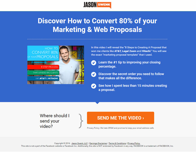
This landing page gives the reader a clear benefit to clicking the offer. It uses bulleted copy to outline the benefits in a scannable manner. (Example Shared on Instapage)
You want to convert emails into sales, subscriptions or downloads by directing customers to your email landing page. Next, we’ll look at the steps needed to develop an impressive email campaign landing page.
What is an Email Landing Page?
If you have found this article, chances are you are well aware of what an email landing page is. But if you’re new to digital marketing, here is the official description from an authority on the topic (Mailchimp)
“Landing pages are standalone web pages that your contacts or potential contacts can “land” on when they click through from an email, ad, or other digital location. Marketers typically use landing pages to achieve specific, short-term goals. For example, you might create a landing page to promote a limited-time offer or sell a specific product.”
A landing page is a web page that an online user will land on when clicking a link in your email. When you develop your email marketing, each campaign should be tailored to a specific landing page.
An effective email landing page will usually include:
- Message Matching
- A Universal Look Between Email and Page
- Simple and To-The-Point Copy and Design
- A Reinforced Message From the Email
- A Singular Call-to-action
- A Short Contact Form
An effective way to test the efficacy of your strategy is to combine various style tactics, content and calls to action to determine which of these prove most appealing and responsive to your target market.
Speaking directly to a specific buyer persona in your industry is the best way to focus on converting visitors.
“Email marketers must work hand-in-hand with conversion rate optimizers to create dedicated landing pages for specific email marketing campaigns.” – Unbounce.com
Landing Page Design Infographic:
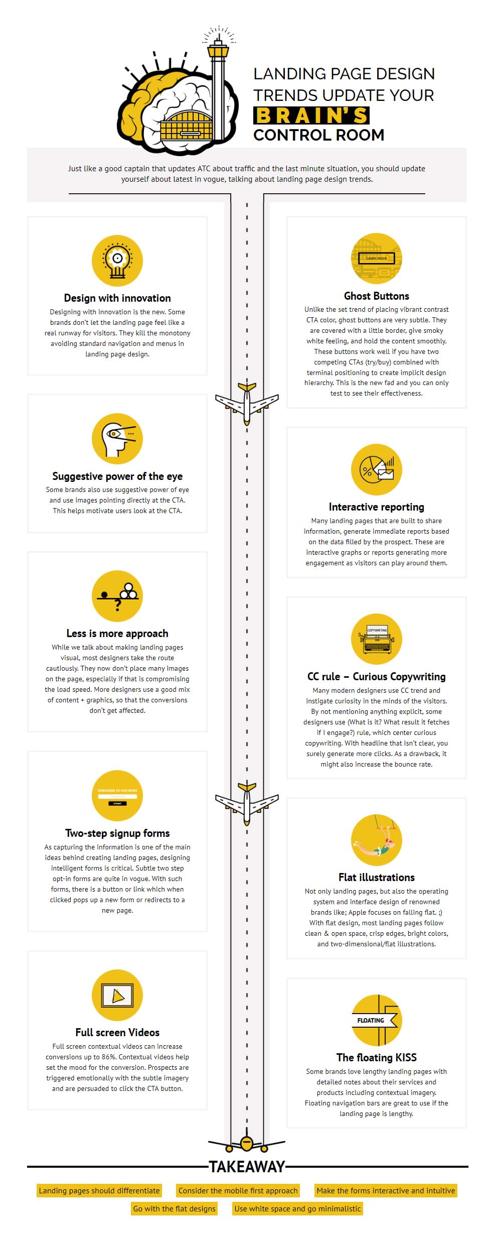
The infographic below was created by emailmonks.com
Creating Effective Email Landing Pages
Like many other things in the digital marketing landscape, getting readers to take action involves a compelling case to move forward. Proving to your audience that your brand is worth their time and money is not something that can be done without a concentrated effort.
The first thing you should probably do is a Google image search for “email landing page design ideas” and get a high-level overview of what others are doing. Don’t try to emulate one of these ideas word for word, just absorb what others are doing for a clear picture of what’s working.
Here is an excellent example of a landing page with a clear call-to-action and beautiful design:
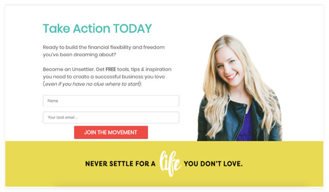
This example shown above was featured on Crazyegg.com because it focuses on a single conversion behavior. The clever use of happy colors mixed with a bold CTA button make this a great example of a high-converting design.
Many of the email landing pages have been tested (extensively) for conversion rate optimization, so make sure you borrow as many great ideas as you can.
The second piece of overall advice I think is important to keep in mind is paying close attention to the user experience. Stop thinking like a marketer for a second and actually digest the information as your target customer would. Does it sounds interesting and make you want to move forward? It should!
A Precision Email Message
To develop a successful email landing page, you first need to develop a strong email marketing campaign. This means that the content in your email message itself must be on-point for your landing page to convert visitors.
To achieve an effective advertising campaign, the content included in your email itself must be simple and to the point. The purpose is to avoid creating confusion at a time when your reader’s attention span is limited.
People want to access the information they need quickly, so create headlines that explain precisely what the email is about. Whether a half-price promotion or the availability of a new ebook, state this clearly to avoid guessing games.
The “bate and switch” routine does not work, so never try to lure your audience in with “click-bait” that has nothing to do with the offer. (It’s a great way to get an unsubscribe).
Focus on a Specific Goal
Do not add multiple links, images, and logos that would steer target audiences away from your website. With so much effort spent trying to get your prospective clients to your landing page, why would you want to give them a chance to abandon the offer?
Keep your audience’s eyeballs glued to your content and persuade them to click where you want with great design and clever content. Most people “skim” over your content in an attempt to speed up the process, so give this type of reader an easy way to digest the information.
Your email landing page has one primary goal, and its to capture new leads by getting your readers to fill out the form fields and convert on your offer. Focus your efforts on making this action take place.
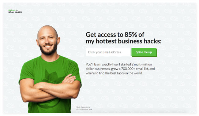
The simple, yet brilliant use of colors in his landing page from Noah Kagan has been tested to convert very well and continue to build his massive email list.
When sending cold email campaigns to list of unsolicited contacts, getting your audience to engage becomes even trickier. This is why understanding the audience of your particular industry is so important.
What works well for Noah Kagan on his blog may not have the same effect on a cold list of accountants. You must test and optimize the landing pages based on performance. Hubspot offers some amazing features for a/b testing your landing pages form an email campaign.
Keep Call-to-actions to a Minimum
Creating a multitude of CTA’s from “click here” to “do that” can be overwhelming to the reader. This presents a poor user experience and hurts the CRO of your landing page. Nobody likes to have too many decision to make when they are in a hurry and were already on the fence about clicking through on your email.
You need to determine what the primary purpose of your email campaign landing page is. It’s usually one of three things:
- What do you want people to know?
- What do you want them to do?
- What do you want to achieve?
A single call to action that leads the reader to a specific goal is best. Don’t try to check off too many checkboxes at once. Yes, you want to use this opportunity to showcase your brand and products, but for a targeted campaign focus your call-to-action on one specific goal.
Align the email with your landing page
The email you create in your promotional campaign should be similar to your landing page. Do not trick your customers by presenting a call to action for a specific product or service and then redirect to a completely unrelated topic. It creates suspicion and distrust leaving you short of loyal followers or much-needed conversions.
This is called message matching, and it’s an important rule to follow in the digital marketing world. Even a change in color scheme, font, or layout is enough to make the reader feel like they’ve clicked on something they shouldn’t have. Compare the design of the email side by side with the landing page, they should flow seamlessly between each other. This strategy alone has been known to increase conversion rate due to a better user experience.
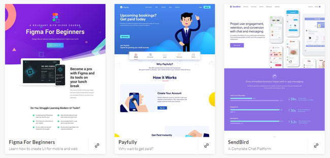
As you can see in the designs featured above, landing pages come in all shapes, size and color combinations. I encourage you to browse the design samples featured on Lapa for some inspiration.
Conclusion
If you have paid attention to the way smart marketing teams angle their landing pages for success, you may have had some eye-opening moments. The best email landing pages are able to channel the readers’ attention towards a solution to a specific pain point.
The entire experience should flow from the headline in the first point of email contact to the final click of the CTA button. Below, is a summary of the elements needed for an effective email landing page that converts the visitors on the page to take action.
What Your Landing Page Needs:
- It needs to be simple but powerful
- It should offer a single call-to-action
- It must be well put together with professional and attractive design
- It should not be bombarded with a multitude of links and logos
- It should stick to the topic and appear similar to the email
I hope you have received value from this post, whether it was through inspiration or marketing education. If you’ve had success in creating landing pages for your B2B email marketing campaigns, please let me know what’s worked for your business in the comments.